
Quality Reporting
Quality directors and analysts use reports to monitor and improve progress for quality programs at their organization.
Outcome: The reporting tool passed Meaningful Use CEHRTification in October 2018. The research was used to design a tangentially related product with the same user types.
Role: End-to-end UX
Team: Product zone of three scrum teams, working closely with one scrum team of a product manager and five developers to execute
Timeframe: Jan. to May 2018
The problem
Quality Directors and Analysts have to go to many different places and apply workarounds to create a mashup version of the quality data they need. This results in a majority of their time reconciling and manipulating data rather than acting on it to improve quality scores at their practices.
Planning with deadlines
Quality Management as a Service was expected to meet Meaningful Use (a government-mandated program) deadlines by October 2018. If we didn’t meet this deadline with all of its requirements defined by detailed documentation, it could cost the company upwards of 200 million dollars. I worked with the Quality Reporting team in the Bengaluru office to design a UI that met requirements but could also be reused for future reporting.
The design had flexibility in mind. It also leveraged work other teams had done to increase efficiency and consistency while minimizing the number of places a user must go to complete their quality related tasks.
Research
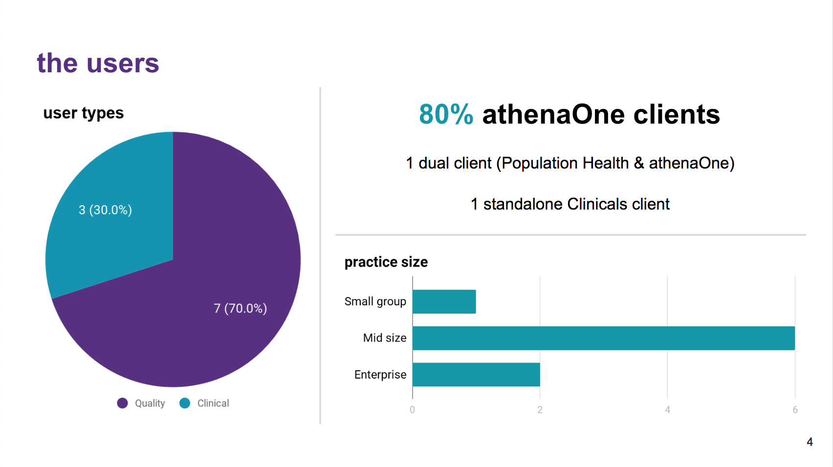
No one at athena had tackled the quality reporting space in quite some time so there was a lot of foundational research to be done. In addition to site visits, I sent out a survey to athena's Research Council, a 1000+ group of our users from different roles, and 60 of them interested in quality reporting responded. I analyzed and presented this research to the zone and it was used to prioritize which issues to tackle first.
Key findings:
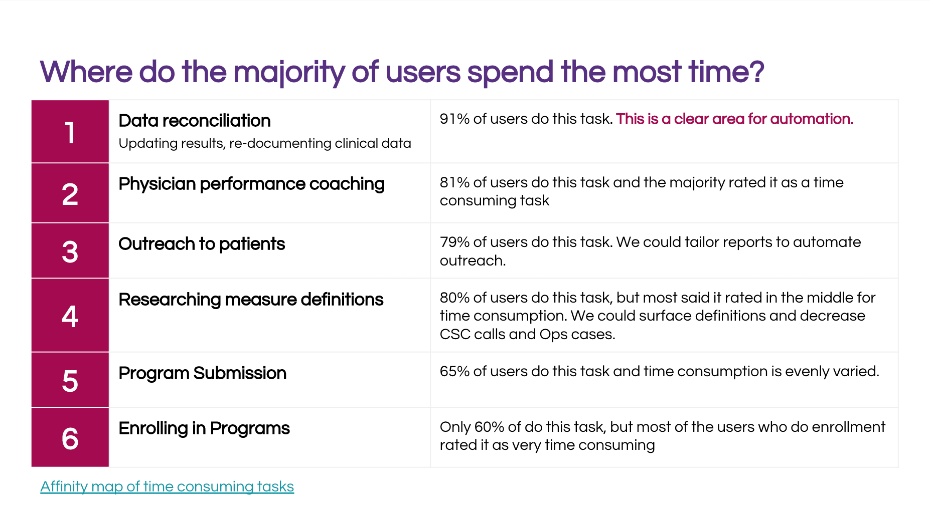
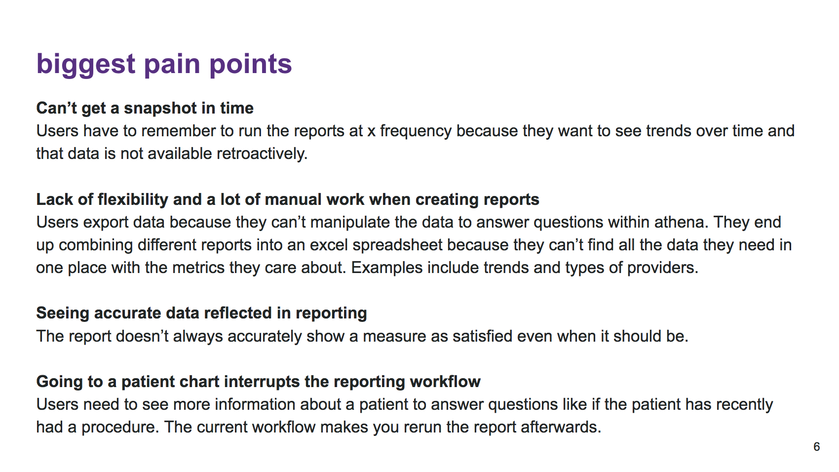
Data reconciliation was the most time-consuming task with the current interface.
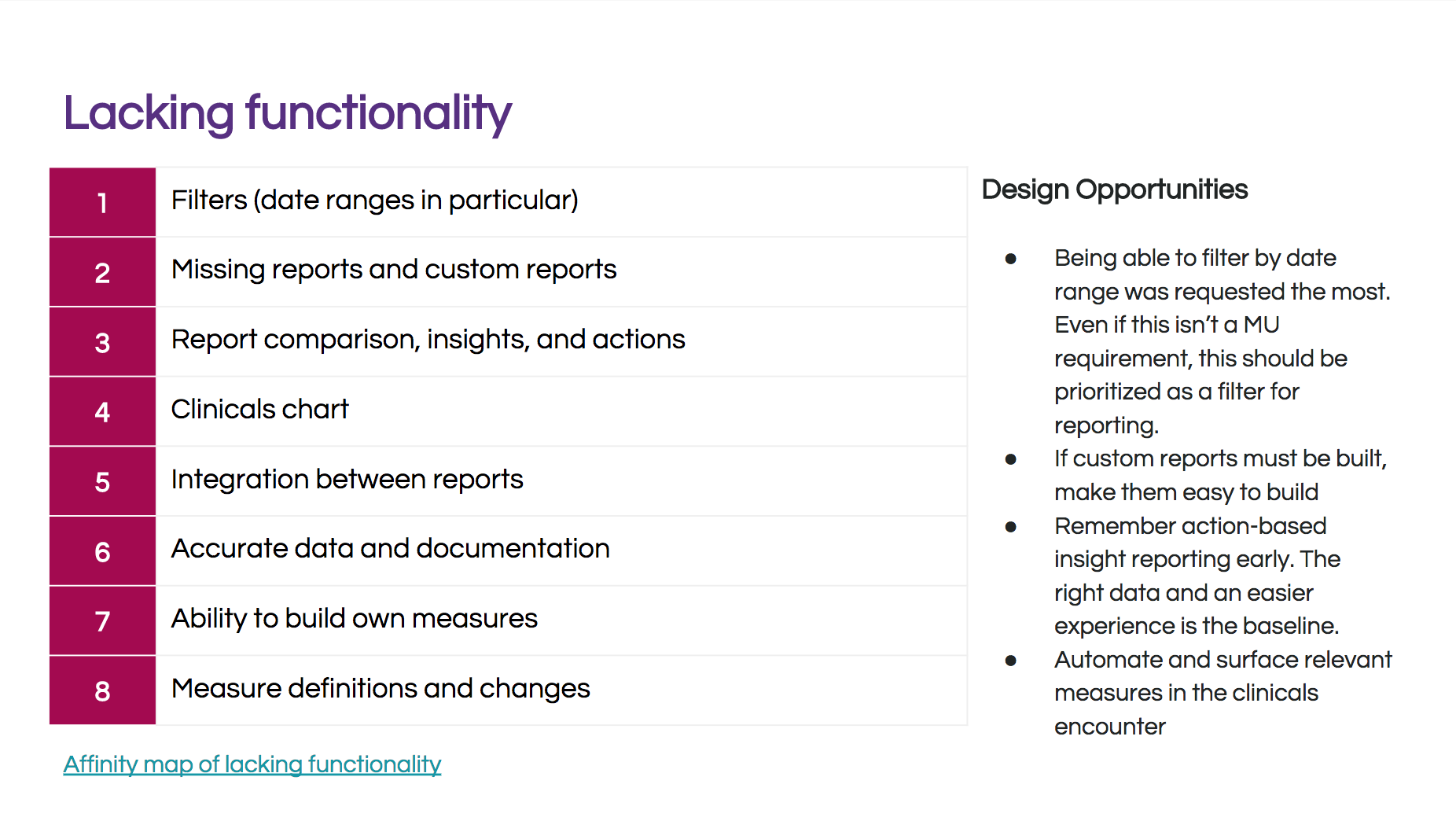
Filters could alleviate many pain points to manipulate the data.
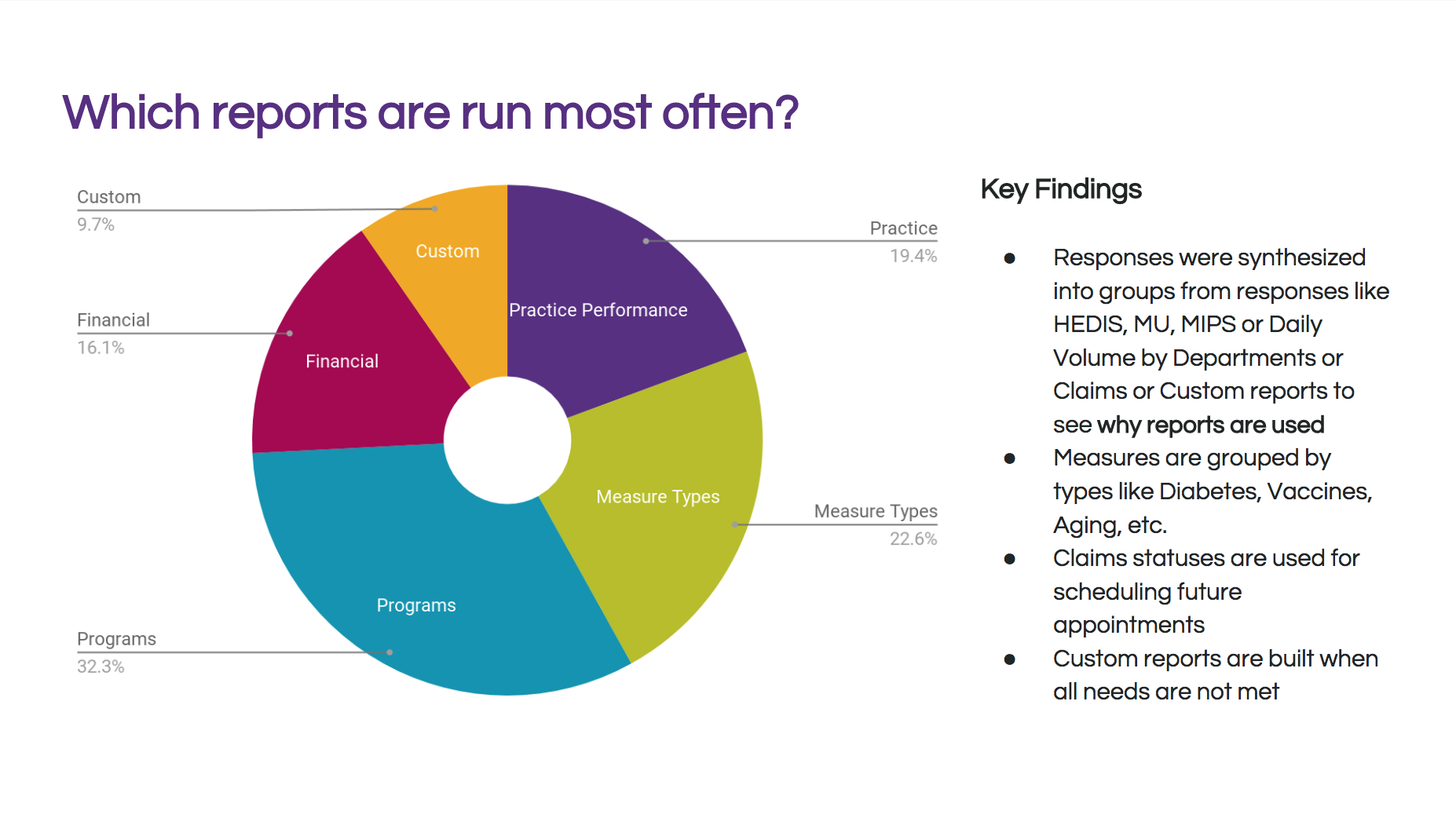
There are a handful of canned reports that users run often that could be automated to save time.
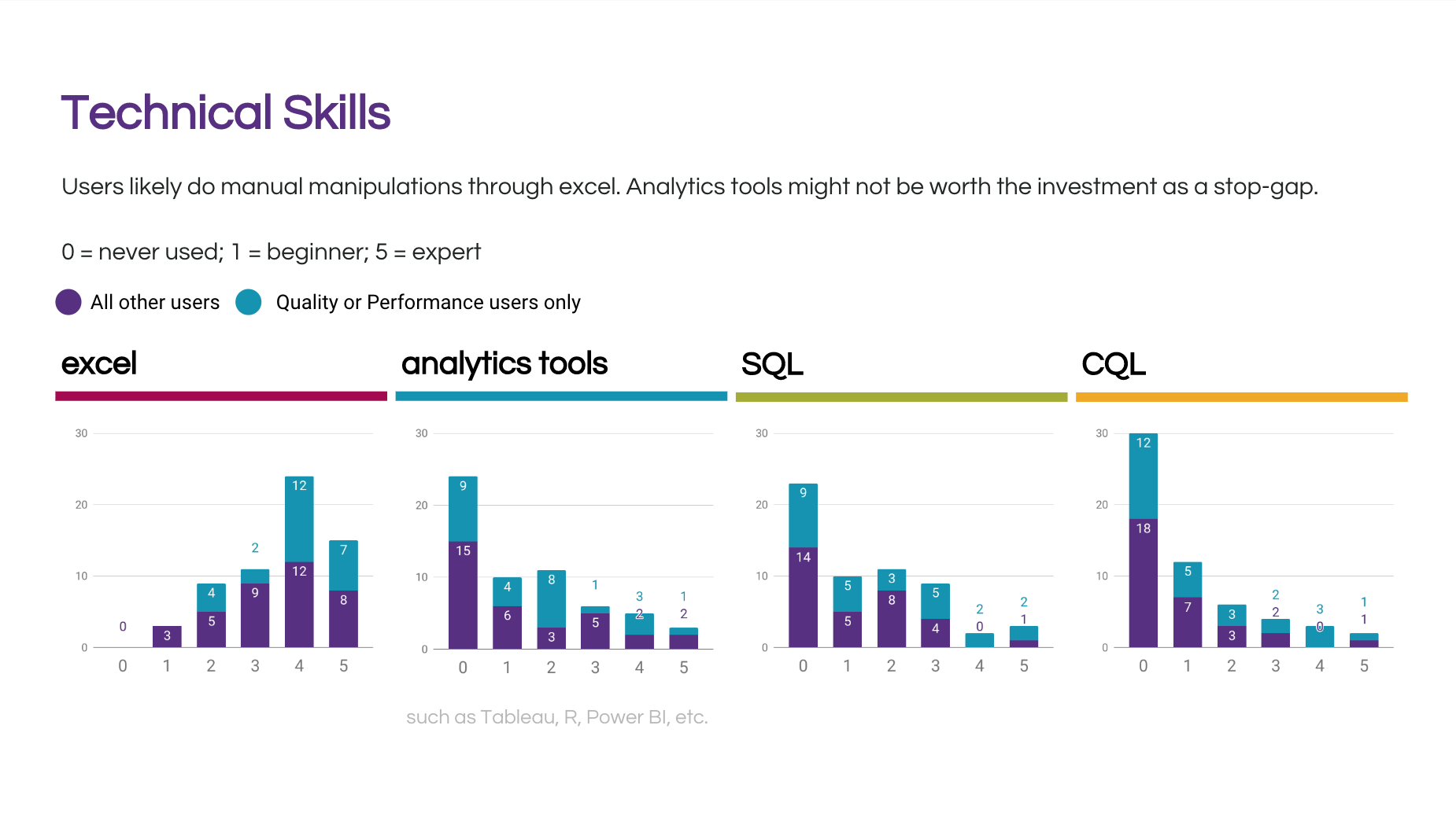
Analytics tools will probably never have every report users need, but they can create those custom in excel with exported data.
Designs
With the future vision and survey results in mind, I designed a clickable prototype for usability testing in Axure.
I ran a usability study with 10 participants from different sized practices to validate and get feedback on the design. I made small changes addressing usability concerns and laid out recommendations for future teams.
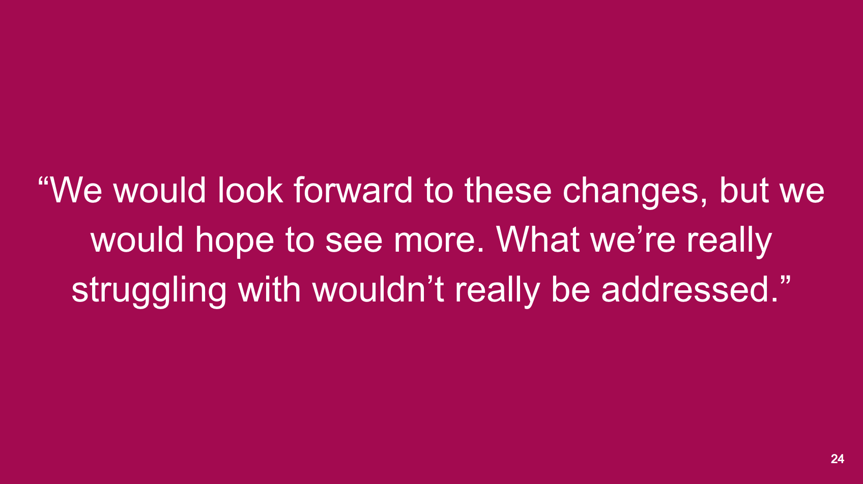
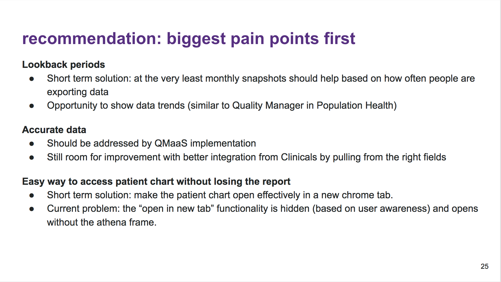
Key finding: The new designs would be appreciated, but snapshots of the data, accurate data, and integration with the patient chart would address bigger pain points.
Outcome
The reporting tool passed Meaningful Use government CEHRTification in October 2018. Additionally, another product has since started building out their quality workflows and has heavily utilized my research to inform their product direction.