
Quantified Communications Redesign
Quantified Communications uses machine learning to give feedback on 24 different communication skills using a 3 to 10 minute video of a presentation. When I arrived at the company, the data was in place, but the experience was overwhelming.
Outcome: We released a new end-to-end redesigned experience in four months that addressed key user goals and pain points.
Role: End-to-end UX
Team: Product Manager, five developers
Timeframe: September 2018 to January 2019
The problem
According to LinkedIn data, communications is the #1 skills gap in the United States. High-level executives might get expensive communication coaches later in their careers, but there wasn’t a scalable solution for employees and students to get personalized, measurable feedback. To improve communication, we needed to present a way for users to assess, develop, and improve their skills.
The Quantified solution
Quantified Communications had a panel of communication PhDs quantifiably assess the largest communications database in the world. Using that data, they developed proprietary algorithms to train a machine learning model to think like a communication expert by making connections between the panel assessments and data from the algorithm.

Now that the model is trained, someone can upload a video of themselves giving a presentation and the model fills out the survey of 24 different communication skills as if a communication expert was watching the video.

Getting a foundational understanding
When I got to Quantified Communications in September 2018, they had the machine learning models in place, but the user experience wasn’t designed to address user needs and was overwhelming.
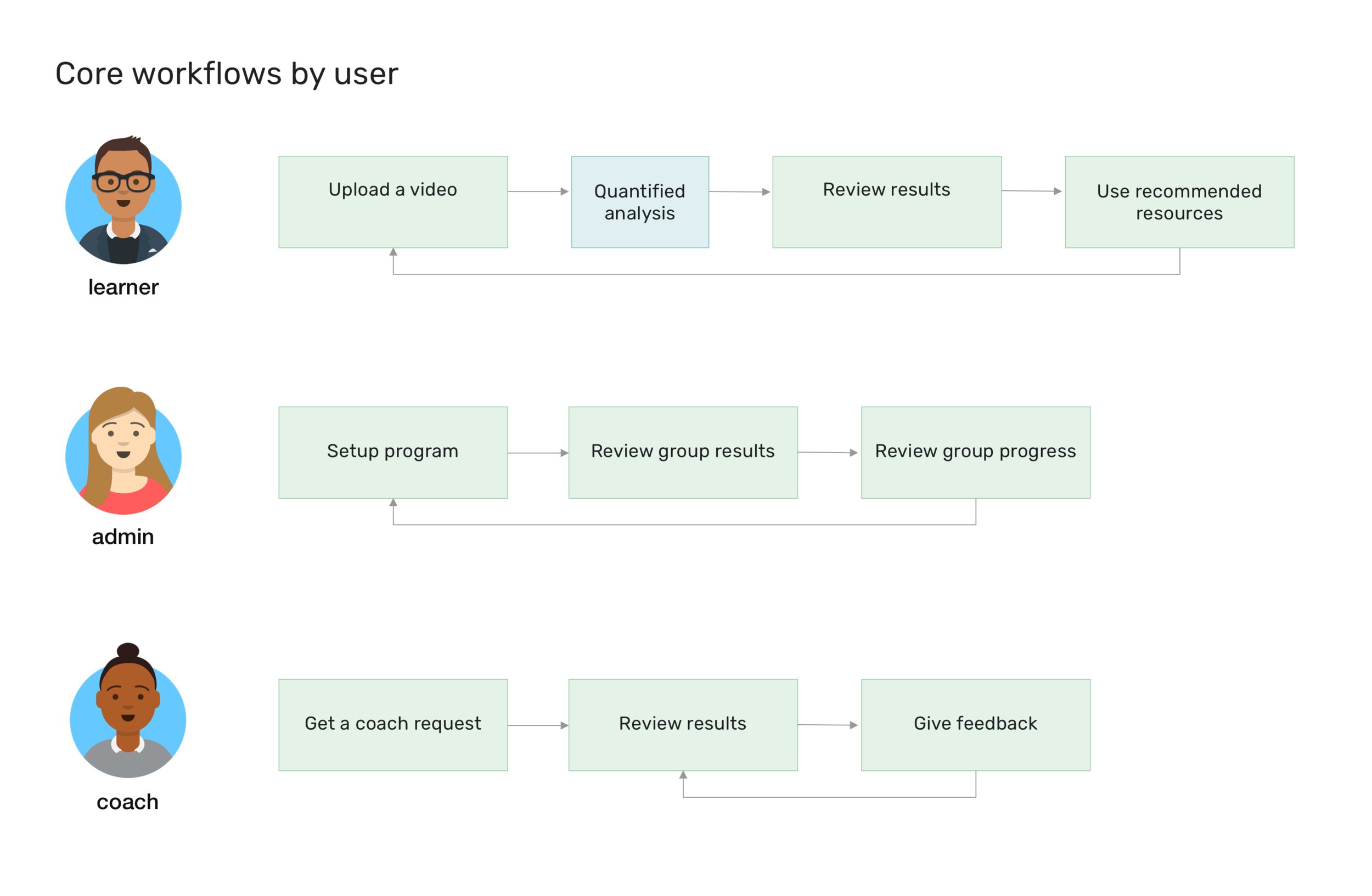
I worked with my product manager to come up with a list of key job-to-be-done and main pain points felt by our three main user types: learners, administrators, and coaches.

Many of their needs could be addressed if a user could record a video, understand the results, and use resources to improve.
Heuristic evaluations
I ran internal heuristic evaluations to identify key problems in the existing user experience to set a baseline as well as make improvements.
Key finding: All of the core workflows had low usability scores, particularly with recognition rather than recall and aesthetic and minimalist design.
Workshop visit
I had the opportunity to sit in on an in-person workshop one of our coach’s ran for a client, where I was able to see how users were interacting with the product.
Key finding: There was a need for results on mobile. I found people were so interested to see how they scored that they were checking their results on their phones if they didn’t have their laptops with them. I required responsive pages as part of the redesign and continued to monitor device usage through Google Analytics.
Sketching, initial designs, and testing
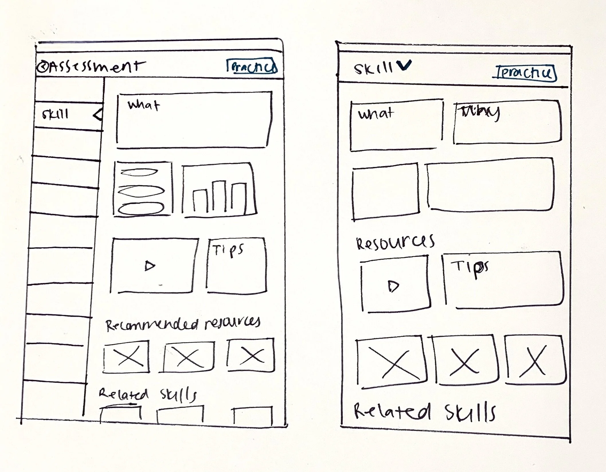
Given the short time frame to release the new experience, I took about five weeks to research while simultaneously designing. I prioritized the results part of the workflow because it was the most complex and difficult to understand.
Results page sketches

Testing with users
After sketching, I designed the following high fidelity clickable prototype using Sketch and Axure. I ran two rounds of user sessions:
Concept testing. I ran a round of moderated concept testing with five users who had never heard of the product to learn what expectations people had around AI for communication feedback.
Usability testing. I ran another round of moderated usability testing for the new results page designs with seven existing users to find any gaps in presentation or understanding. I focused on the results workflow because it was the most complicated to understand.
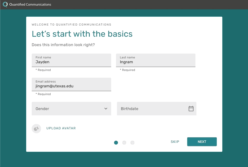
First time onboarding
This is a concept for the user onboarding to explain the product to a first time user.
Key finding: Users said the onboarding tutorial provided the right amount of information before diving into the product.
Home page
This is a concept for home page design tested with a first time user.
Key finding: Next steps from the home page were varied. Clearer directions and guidance could give users a more successful experience.


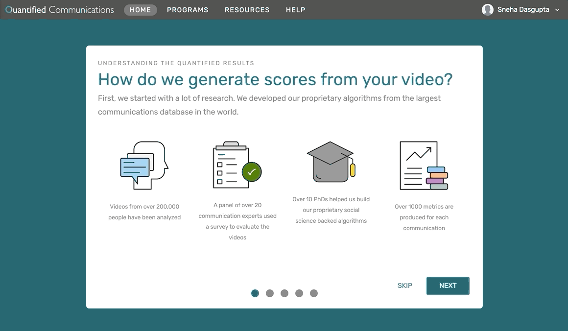
Results tutorial
The results tutorial presented to users before the first time seeing results tested in usability testing.
Key finding: Learners needed a simpler explanation to trust that machine learning could evaluate communication.
Results and skill pages
Result page and skill page usability tested with existing users to identify issues in results presentation.
Key findings
Learners didn’t understand if their scores were good or not. Lack of score comparisons per skill and the green color scheme confused users.
Next steps were unclear. Although all users found more information about each skill based on the usability task, the amount of information and order presentation was overwhelming.

Design system and style guide
For development, we decided to keep Angular Material Design as the base for the design system. This was the easiest way to address accessibility needs and allowed us to build the custom components for a larger design system. We adjusted the theme to match the new style and tone of the product: serious, casual, respectful, and enthusiastic.
Release
After four months of development, we released a brand new end-to-end user experience for the product. It still required a lot of iteration, but users could upload videos, understand their results, and use resources to improve. Since then, we’ve transitioned to releasing every three weeks. The following pages are live in production.

Results onboarding
I updated the results tutorial with a more visual explanation limited to the most vital information.
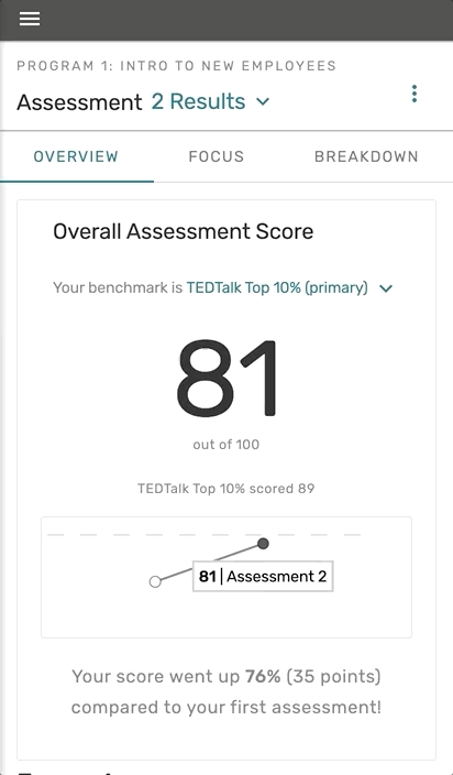
Results and skills pages
I added clear, comparable benchmarks and adjusted the colors so it was easier to know which they had to work on.
I rearranged the skill detail page to reflect the order of the resources that resonated with most users: an example of the skill done well and steps to improve.

Results on mobile
The results page on mobile so users can check their assessment as soon as they get the email on their phones.