
Quantified Communications Product Vision Execution
After releasing a redesign of the Quantified Communications platform, I set out to work on the next steps of the product vision.
Outcome: Within three months the product’s Net Promoter Score went up 130%. The release of the new workflows will support 4000+ users per accounts.
Role: End-to-end UX
Team: Product Manager, five developers, QA, Customer Success, Account Managers
Timeframe: February 2019 to present
The problem
Although the new redesign solved many of the previous user experience problems, it didn’t focus enough on the improvement aspect of learners’ experience, which caused a dip in engagement after the initial assessment.
Core workflows to product vision
After the redesign, my product manager and I had four main goals:
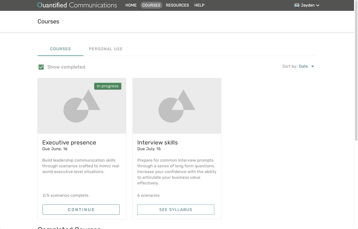
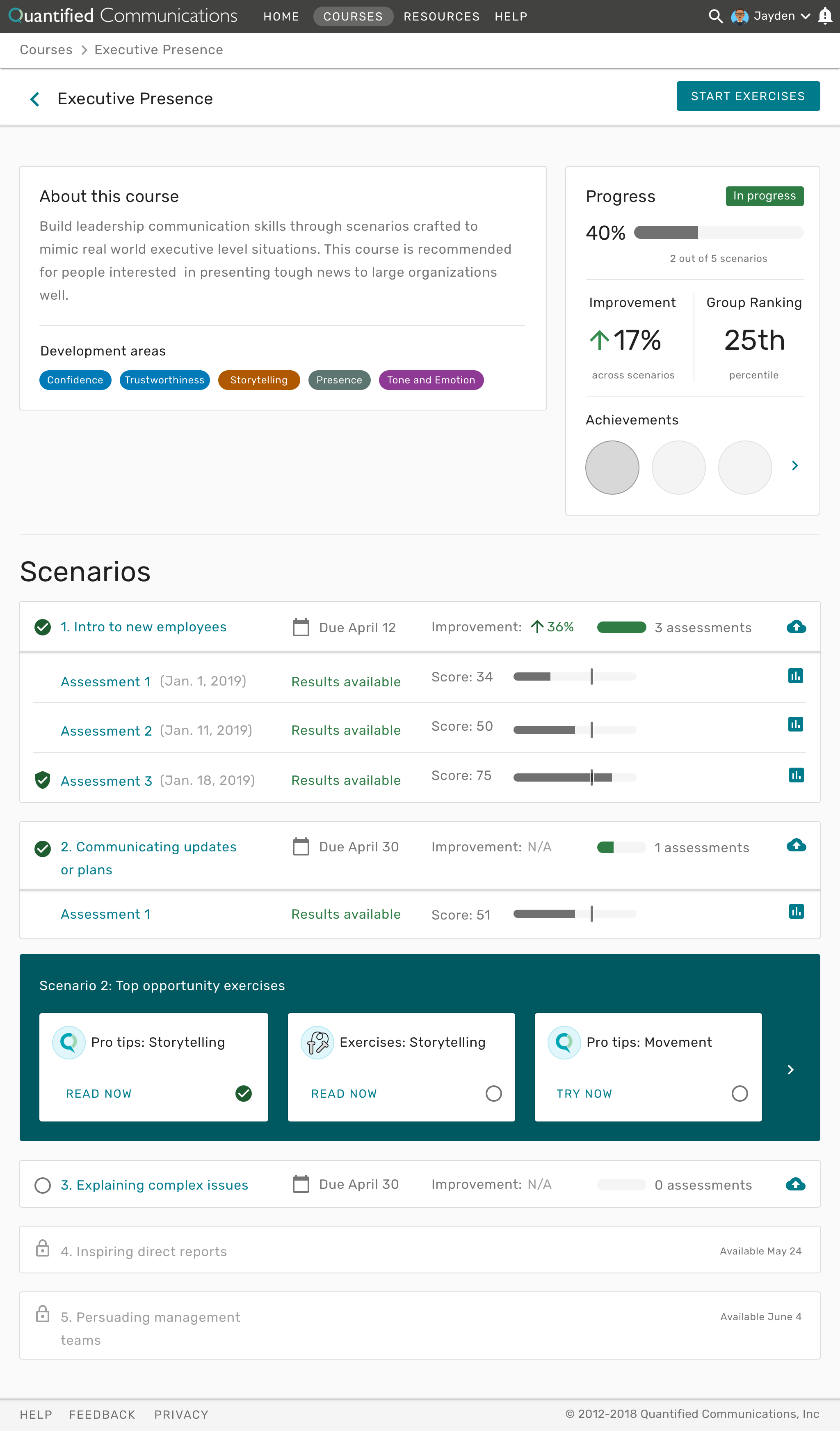
Courses. Implement a streamlined learner workflow using “courses” that groups together a series of scenarios to accomplish a larger learning goal.
Interactive exercises. Create interactive exercises to help learners improve communication skills by maximizing effectiveness and engagement.
Increase engagement. Identify where user engagement fell off and how we could iteratively address those issues.
AA compliance. Establish a path to AA WCAG compliance to both broaden our potential clients and build the best product for all users.

The current Quantified sitemap with the future product vision.
Quantitative Research
To learn from the redesign we released, we collected data in four ways: email open rates, resource ratings by type, custom unique user actions, and Google Analytics.
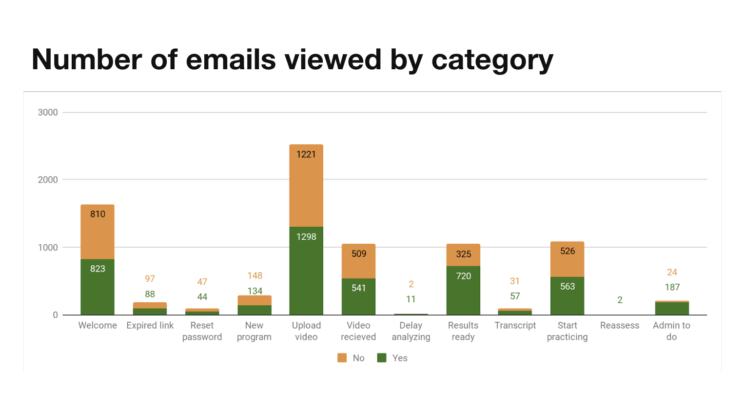
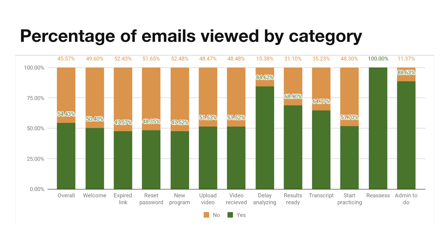
Email open rates
Since most of our communication to users is through emails, we tracked open rates to see how effective emails were and which emails needed to be reconsidered.
Key finding: On average, our email subject lines were effective (54% open rate compared to 26% across the industry), but there was a drop off in the resources section of the workflow based on the email logic initially implemented.
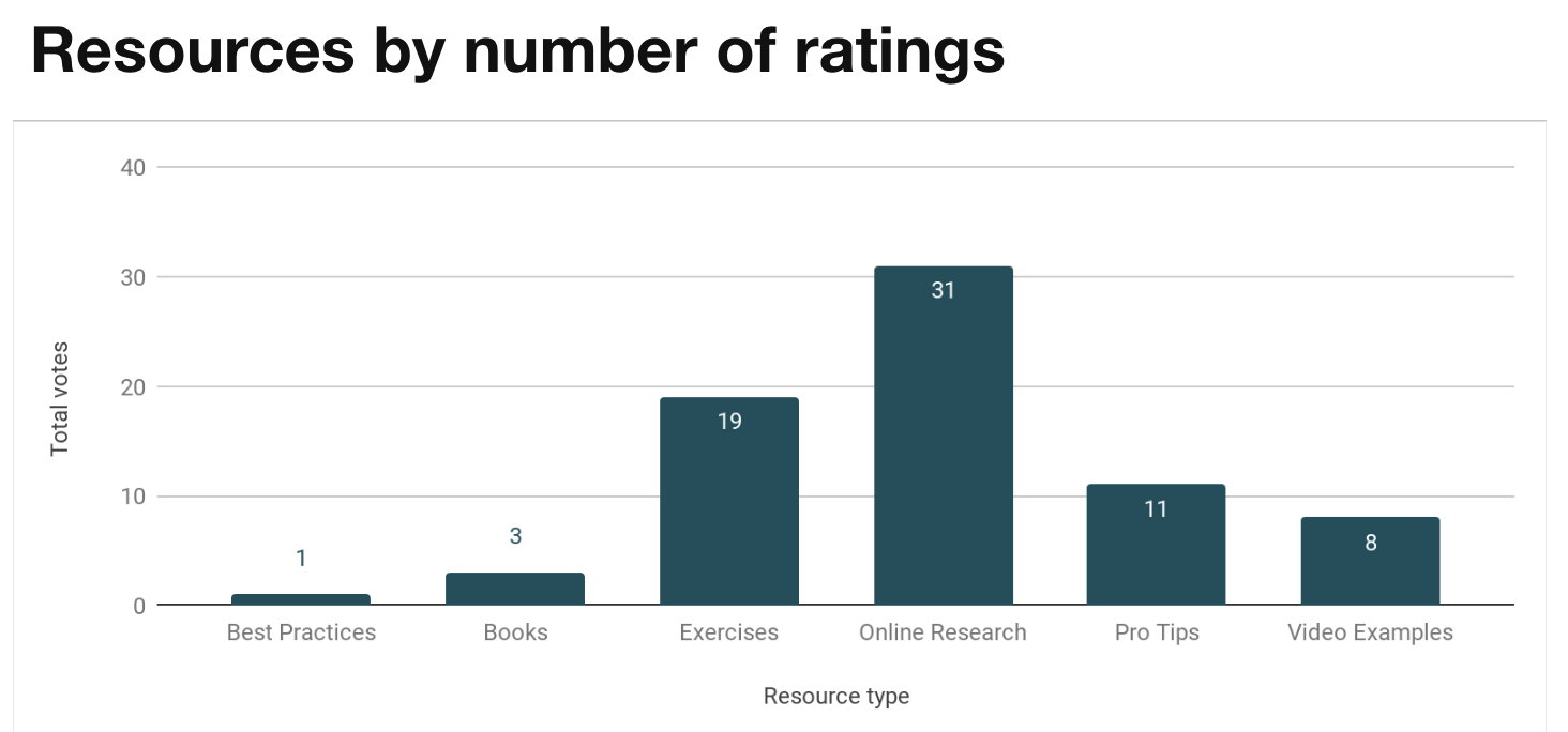
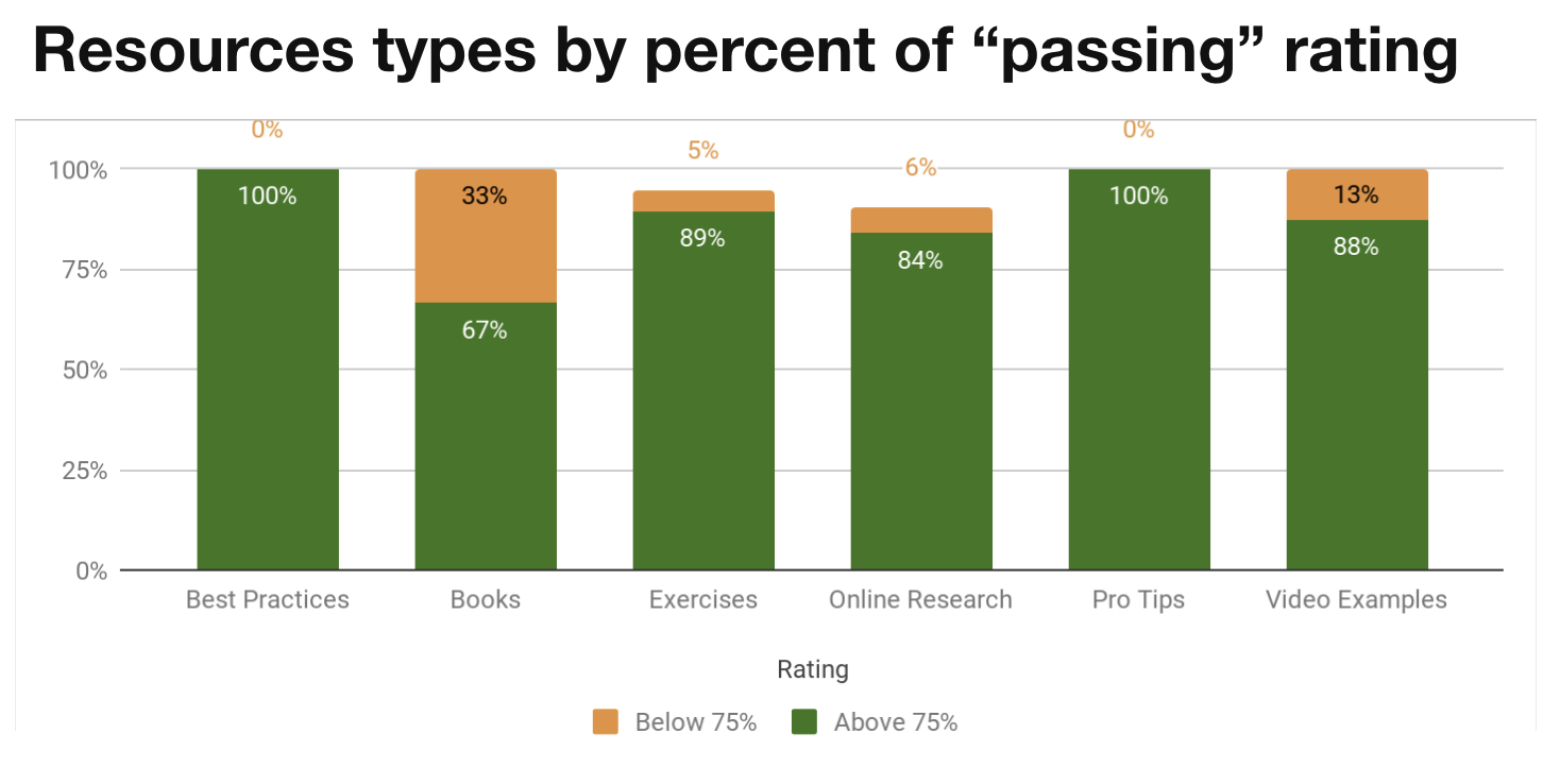
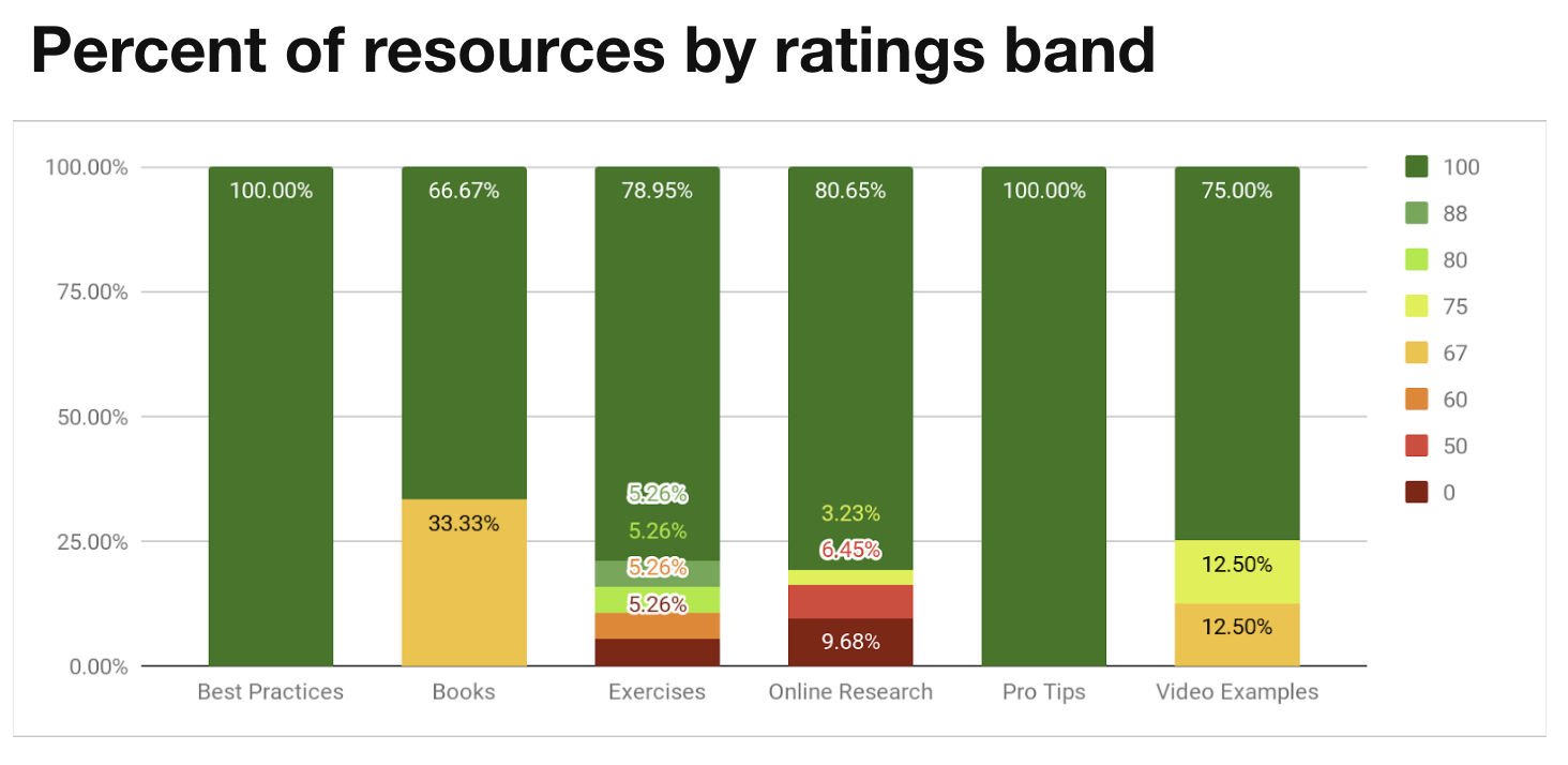
Resource types
To understand what users found the most helpful to get better, resources are organized into the following categories: pro-tips, exercises, video examples, online research, and books. At the bottom of each resource, users were asked “Was this helpful? Yes or No” in the product.
Key finding: The resource types on for individual skill pages and the next planned iteration of resources are primarily all rated above 75%.
User actions
We started tracking user actions for key events such as if a user clicks on a call to action from the home page, if a user decides to upload a video vs. record one in the platform, or if a user looks at resources after viewing their results.
Key finding: Users are engaged enough to log in, upload a video, and view results. Fewer go on to dig into the results and look at resources. Since we also knew that the most improvement happens when resources are used, it makes sense to focus on that part of the learning workflow.

Google Analytics
Since user actions are tracked separately, Google Analytics mainly gave insights into device and browser usage.
Users are split by device with 72% on desktop and 28% on mobile or tablet. They’re spending less time on their phones by an average of 3 minutes.
66% of users are Chrome users but 25% of users are Safari users. Edge and IE usage together accounts for less than 6% of users, and less than 3% of sessions
Key finding: We should continue to improve the mobile experience across the platform and invest resources into video recording on Safari.
All this analysis was also great to set a baseline for the future.
Qualitative research
I did a moderated hybrid concept and usability test with seven learners to answer three main questions.
Would the new course structure help them complete the learning workflow?
What kind of resources are most engaging to improve communication skills after such a detailed assessment?
If courses and interactive resources are useful, could learners use the designs effectively?

A potential workflow for interactive exercises that guides the learner through resources with flexibility, rather than relying on user exploration
After sketching, I designed high fidelity clickable prototypes for courses and interactive exercises in Sketch and Axure.
Key findings:
Learners are busy and Quantified is not a top priority. Users have very little time in their day to use Quantified on top of their other commitments. They liked the concept of three to five minute exercises because they could complete them between meetings.
Due dates are extremely motivational. Deadlines and requirements as part of a company or course provide the most motivation to complete assessments. Due dates being pulled forward into the application could keep users on track.
Communication skills must directly link to career development. Second to deadlines, users are internally motivated to see improvement in their communication skills for career development. Tying the scenarios and exercises directly to career development could add value for internally motivated users.
Designs for implementation
There are many changes we’ve made as a result of research, but some prominent changes include:
AI explanation. Qualitative NPS feedback suggested that there is some AI mistrust, especially when learners get low scores. We pulled the information we already showed in an optional tutorial about how AI works to the home page as a resource that’s available at any time.
Emphasizing the number of assessments per scenario to improve. We highlighted the expectation that users should record at least three videos per scenario using the progress indicator on the course page, as well as messaging throughout the product.
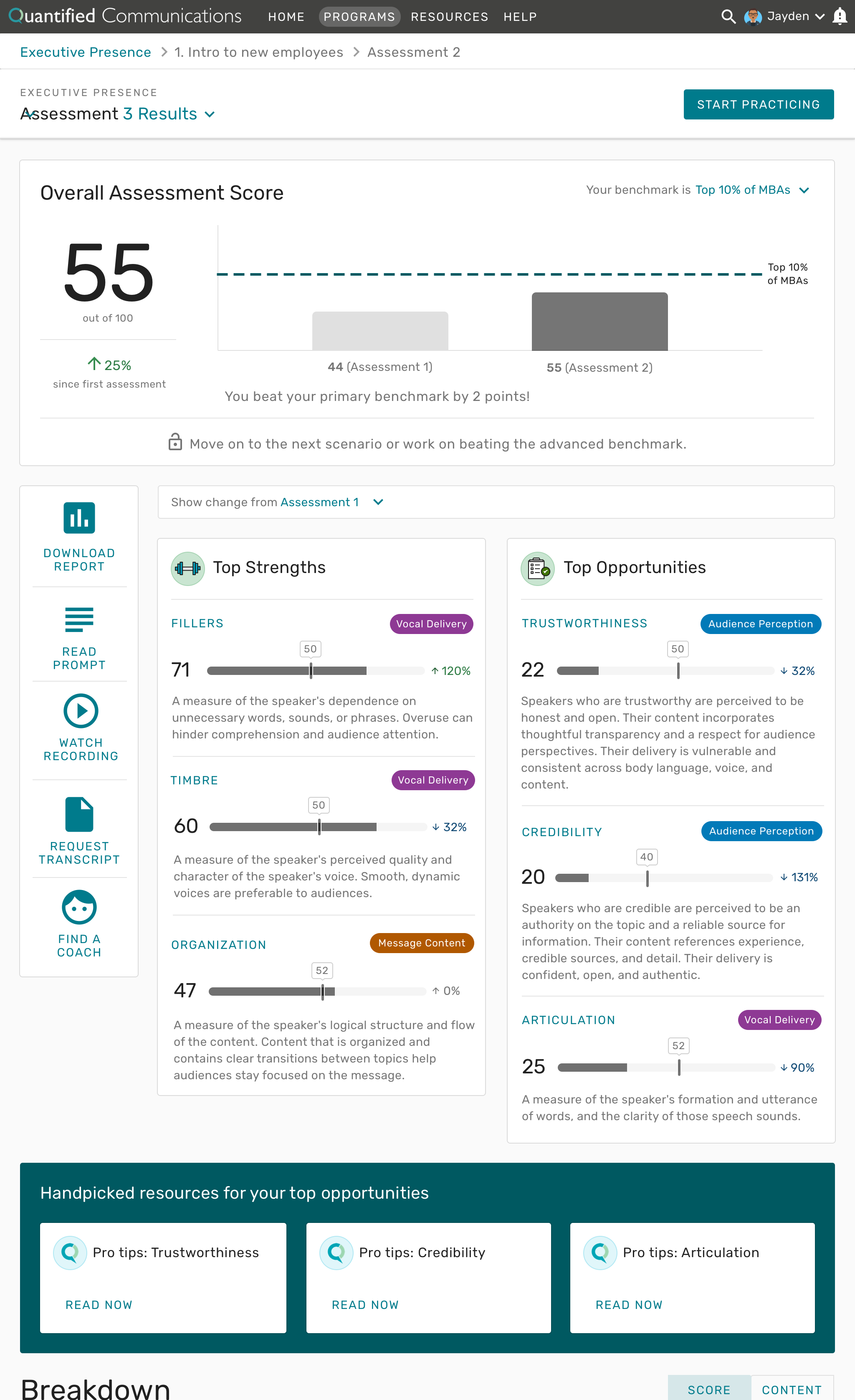
Encouraging visuals and messaging. We softened score presentation for users who scored lower by including more encouraging messaging and used neutral colors so that users would stay motivated.
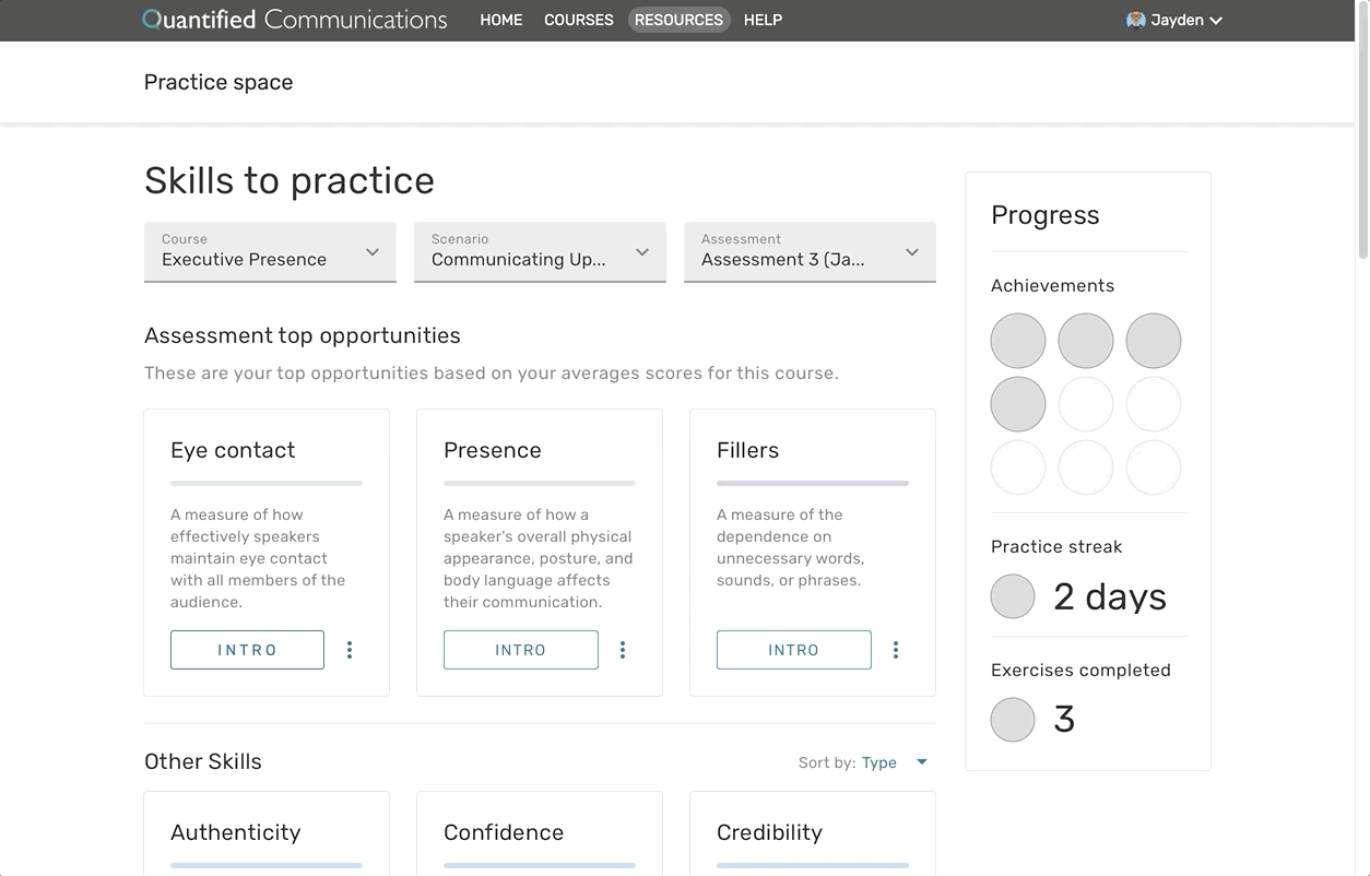
Integrating resources. To address the drop in engagement for resources, the designs put resources for their top three opportunities on the pages learners were already visiting.
Below are designs for the new course workflows that are currently being implemented.
Accessibility
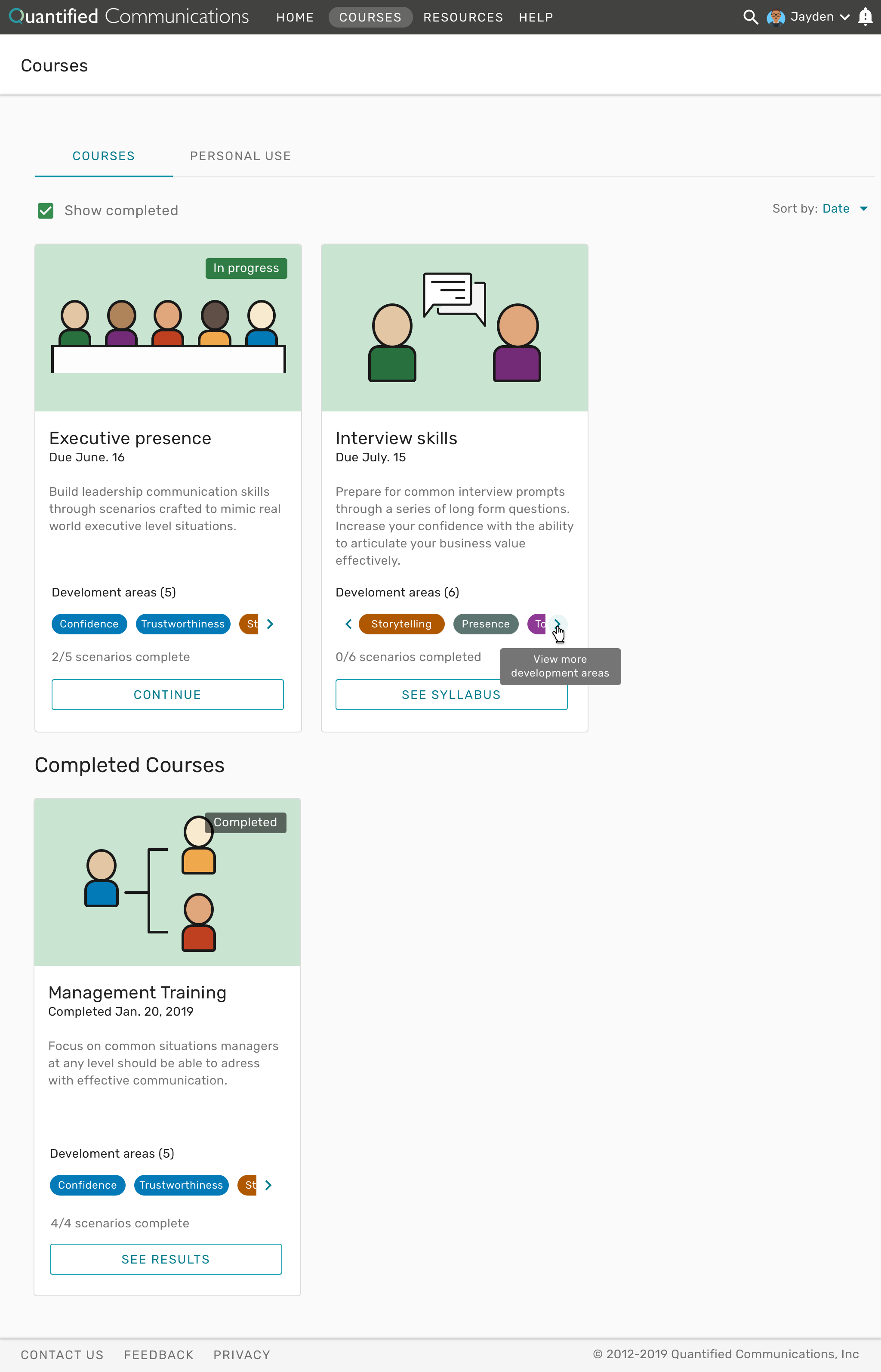
Whenever possible, I try my best to design an accessible product. All the colors and font sizes I used for the redesign already passed AA compliance because I selected them using the Stark Sketch plugin, but more front-end development heavy features still required adjustments. To get started I used the Voluntary Product Accessibility Template (VPAT) checklist to make a list of what needed to be addressed. I used the knowledge I had about the product and the Google Chrome WAVE extension to identify problems. I populated an “Accessibility” Epic in JIRA with stories for proposed solutions. A few stories are part of each sprint so that the product is AA compliant by the end of 2019.

A screenshot for one of the pages I wrote accessibility stores for to meet compliance.
Net Promoter Score
In April we put a Net Promoter Score questionnaire into the platform. At the end of April, we had an NPS of -13. With quick iteration, our NPS trended upwards to +4 by the end of July — an improvement of 130% in three months. The majority of our detractors are not convinced that AI can evaluate communication, so we’re hopeful that more explanation and a positive product experience can help build that trust.
Outcome
The team continues to learn and iterate from releases every three weeks. The product will soon be able to support our accounts with over 4,000 users in a scalable and engaging way with an NPS score that continues to trend up.